Dual Platform, One Philosophy.
듀얼 플랫폼, 하나의 원칙.
- E-COMMERCE
- Information Architecture
- Web Design
- Web Development
- Image Production
2026
ATELIER DE LUMEN

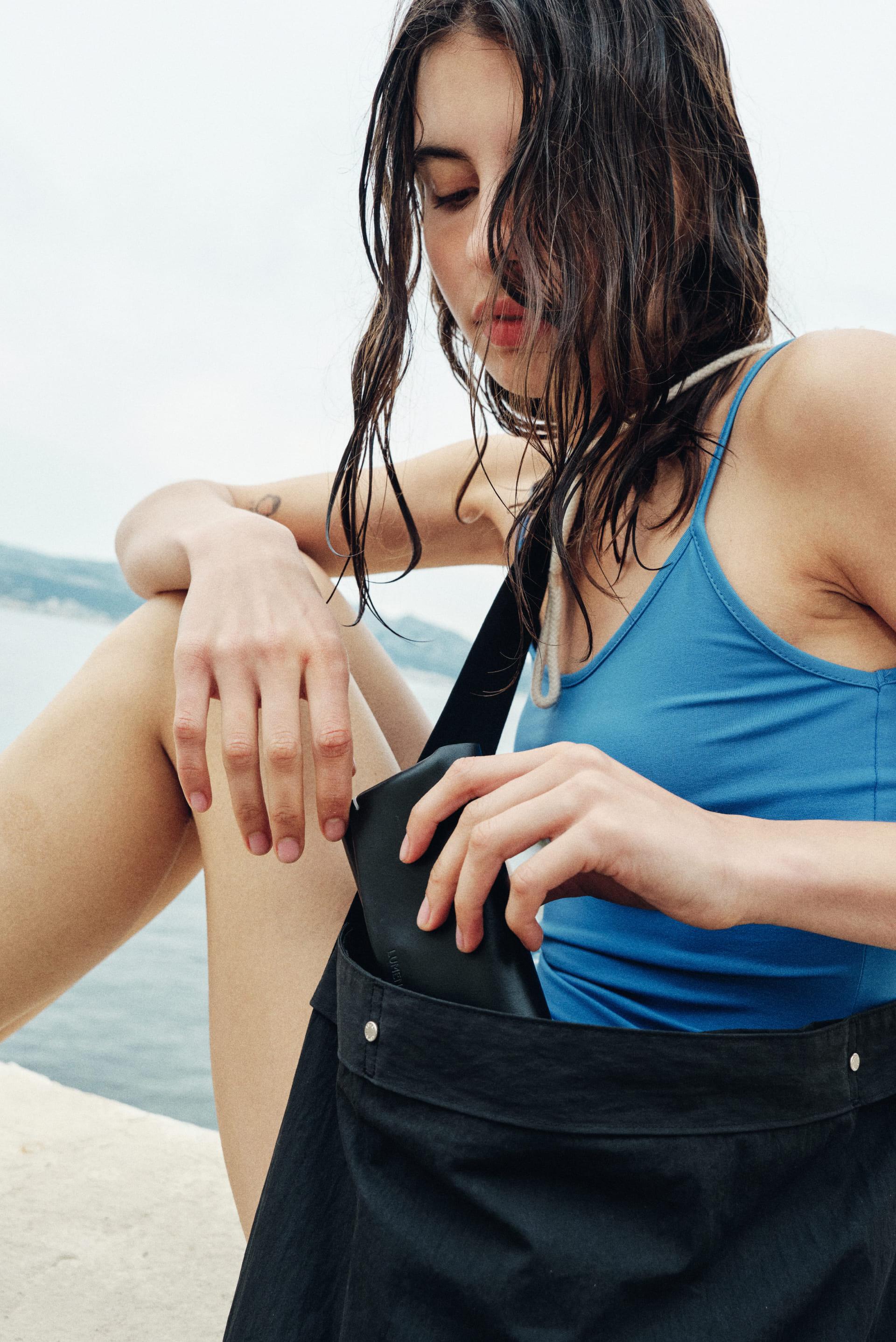
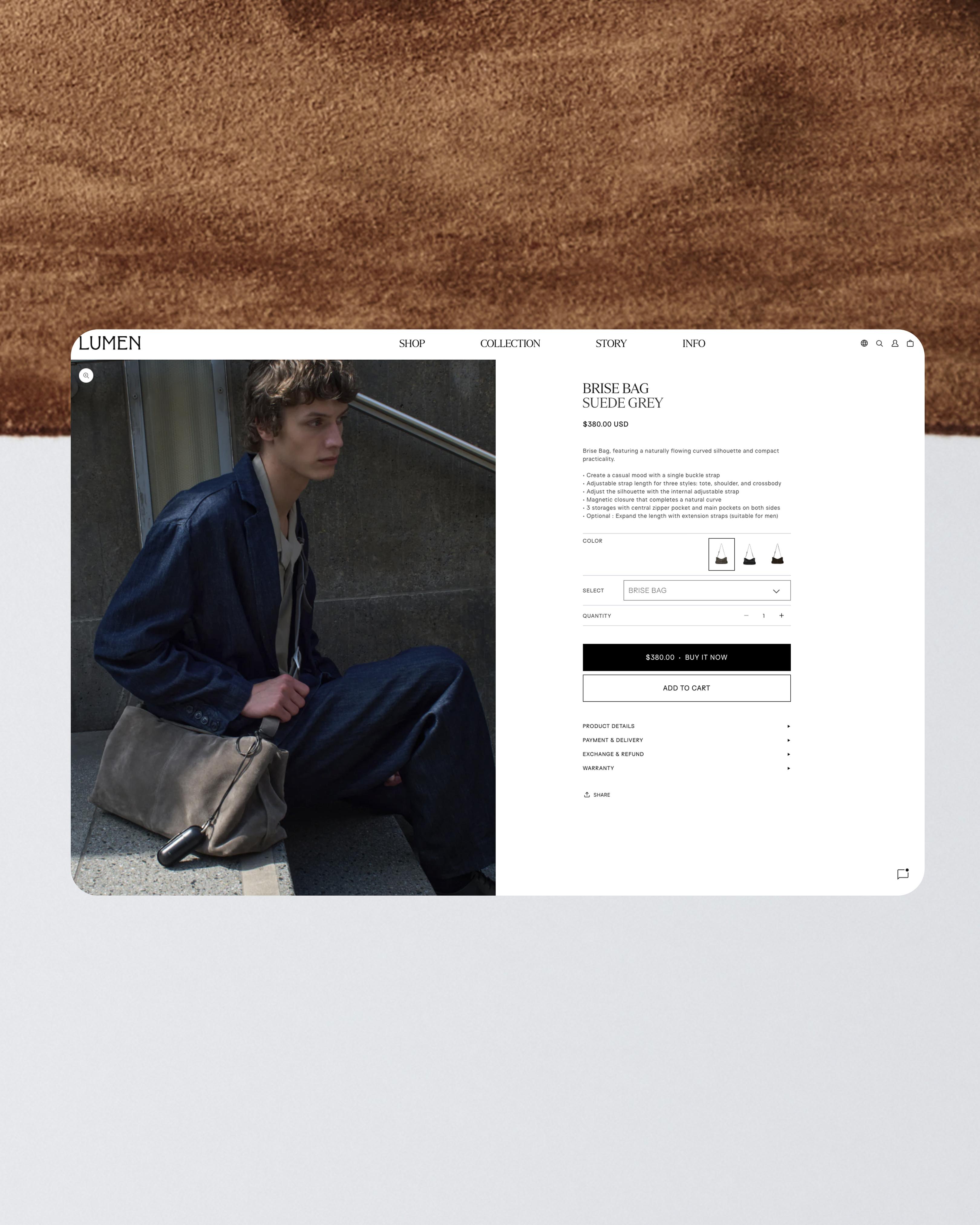
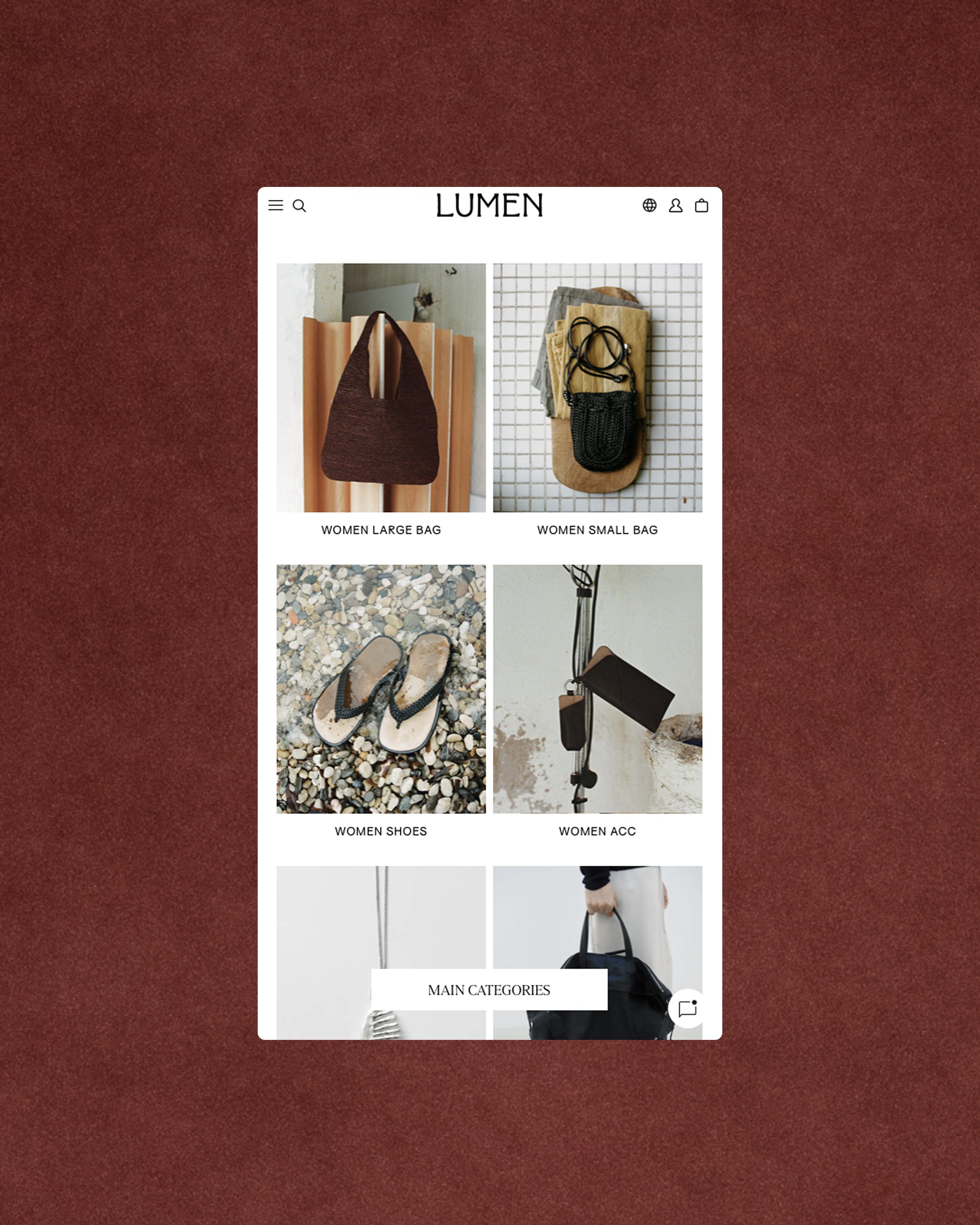
OTP Company led image direction and production, along with the planning, design, and development of ATELIER DE LUMEN’s domestic Cafe24 and international Shopify e-commerce websites, to help customers explore the forms, materials, and refined finishes of its products online. Using light and contrast to reveal product silhouettes and leather textures, we designed product information, browsing flows, and operational workflows around a consistent brand experience across both platforms, which launched in late March 2026.
OTP Company는 아뜰리에 드 루멘 제품의 형태와 소재, 정교한 마감을 온라인에서도 살펴볼 수 있도록 이미지 디렉션과 프로덕션, 국내 Cafe24·해외 Shopify 이커머스의 기획·디자인·개발을 진행했습니다. 빛과 대비로 제품의 실루엣과 가죽의 질감을 드러내고, 서로 다른 플랫폼에서도 일관된 브랜드 경험이 이어지도록 상품 정보와 탐색 흐름, 운영 방식을 설계해 2026년 3월 말 국내·해외 이커머스를 오픈했습니다.


Purpose. Reading Product Craftsmanship Online.
ATELIER DE LUMEN’s e-commerce renewal set out to translate the value of lasting forms, considered materials, and refined finishes into an online experience that supports understanding and choice. Customers needed to be able to examine products that sit naturally within everyday life while expressing a distinct presence through proportion and balance. Without the opportunity to touch them, it was important to communicate differences in texture, color, and size, connecting sensory impressions with informed purchase decisions. OTP Company began by looking at each product as one might look at furniture: examining its structure, form, materials, and how it is made. From taking in a bag’s overall proportions and silhouette to studying the grain of its leather and the smallest details, we wanted customers to discover its craftsmanship at different distances. This perspective informed our approach to both image production and the structure of the e-commerce interface and information. The domestic and international websites also needed to accommodate different platforms and operating environments. While working within the structures of Cafe24 and Shopify, we sought to maintain the same brand sensibility as customers viewed products, read information, and made their choices. We also considered the teams managing products and content, so that the brand’s expression could be sustained through everyday operations.
목적. 형태와 소재의 가치를 이해하고 선택하는 경험.
아뜰리에 드 루멘의 이커머스 리뉴얼은 오래 사용할 수 있는 형태와 소재, 정교한 마감에 담긴 제품의 가치를 온라인에서 이해하고 선택하는 경험으로 연결하는 과제였습니다. 일상에 자연스럽게 어우러지면서도 비례와 균형에서 고유한 존재감을 드러내는 제품을, 고객이 화면 안에서도 충분히 살펴볼 수 있어야 했습니다. 직접 만져보기 어려운 환경에서 소재의 질감과 색상, 크기의 차이를 전하고, 감각적인 인상이 구체적인 구매 판단으로 이어지도록 하는 것이 중요했습니다. OTP Company는 가구를 바라보듯 제품의 구조와 형태, 재료와 만들어진 방식을 살피는 시선에서 출발했습니다. 가방 전체의 비례와 실루엣을 바라보는 순간부터 가죽의 결과 작은 디테일을 들여다보는 순간까지, 서로 다른 거리에서 제품의 완성도를 발견하는 경험을 만들고자 했습니다. 이미지 제작과 이커머스의 화면·정보 구조를 함께 다룬 이유도 여기에 있었습니다. 국내와 해외 이커머스는 서로 다른 플랫폼과 운영 환경을 바탕으로 구축해야 했습니다. Cafe24와 Shopify 각각의 구조에 맞추면서도, 고객이 제품을 바라보고 정보를 읽고 선택하는 과정에서는 같은 브랜드의 감각을 경험하도록 하는 것이 또 하나의 과제였습니다. 상품과 콘텐츠를 관리하는 팀의 업무까지 고려해, 브랜드의 표현과 실제 운영이 함께 이어지는 방향을 세웠습니다.


People. Customers with Their Own Taste, Teams Who Know the Products.
Through a brand questionnaire, in-person meetings, and requirements shared by the domestic merchandising and customer service teams and the international team, OTP Company clarified the customers LUMEN envisioned and the information needed throughout the sales process. The brand imagined customers who choose according to their own taste rather than trends. Supporting those choices required clear communication of differences in material, color, and size alongside the brand’s aesthetic. Discussions with the teams raised specific questions: how to show subtle differences between similar colors, which images and descriptions could communicate material qualities, and when customers should encounter shipping and exchange information. Together, we examined how customers’ attention might move from their first impression of a product to the information needed to make a purchase. We gave equal consideration to how the teams prepared products and content. Reviewing the product data and registration methods used domestically and internationally, along with the information each platform required, helped us understand both the customer-facing experience and the work needed to maintain it. OTP Company led the overall planning, creative direction, and art direction. UX/UI design was developed with Joheun Yeom, and photography was produced in collaboration with Kyeonghee Kang. Joheun Yeom and Yesaem Kim supported image production as assistants, while development was carried out in collaboration with Jinyoung Park.
사람. 제품을 고르는 고객과 그 가치를 전하는 팀.
OTP Company는 브랜드 질문지와 대면 회의, 국내 MD·CS 및 해외팀의 요구사항을 통해 루멘이 지향하는 고객상과 실제 판매 과정에 필요한 정보를 구체화했습니다. 브랜드가 생각하는 고객은 유행보다 자신의 취향을 기준으로 제품을 선택하는 사람이었습니다. 그 선택을 돕기 위해서는 브랜드의 미감과 함께 소재와 색상, 크기의 차이를 명료하게 전달할 필요가 있었습니다. 실무팀과의 협의에서는 비슷한 색상 사이의 미묘한 차이를 어떻게 보여줄지, 소재의 특성을 어떤 이미지와 설명으로 전할지, 배송과 교환 정보를 어느 단계에서 확인하도록 할지 같은 구체적인 질문이 드러났습니다. 제품을 처음 접했을 때의 인상과 구매를 결정할 때 필요한 정보가 연결되도록, 고객의 관심이 이동하는 흐름을 함께 살폈습니다. 운영팀이 상품과 콘텐츠를 준비하는 과정도 중요하게 다뤘습니다. 국내와 해외에서 사용하는 상품 자료와 등록 방식, 플랫폼별로 입력하거나 연결해야 하는 정보를 확인하며 고객에게 보이는 화면과 이를 유지하는 업무를 함께 이해했습니다. OTP Company는 프로젝트 전반의 기획과 크리에이티브·아트 디렉션을 맡았습니다. UX/UI 디자인은 염조흔과 함께 진행하고, 촬영은 강경희와 협업했습니다. 이미지 프로덕션에는 염조흔과 Yesaem Kim이 어시스턴트로 참여했으며, 개발은 Jinyoung Park과 협업했습니다.


Practice. Revealing Form Through Light, Connecting It Through Information and Operations.
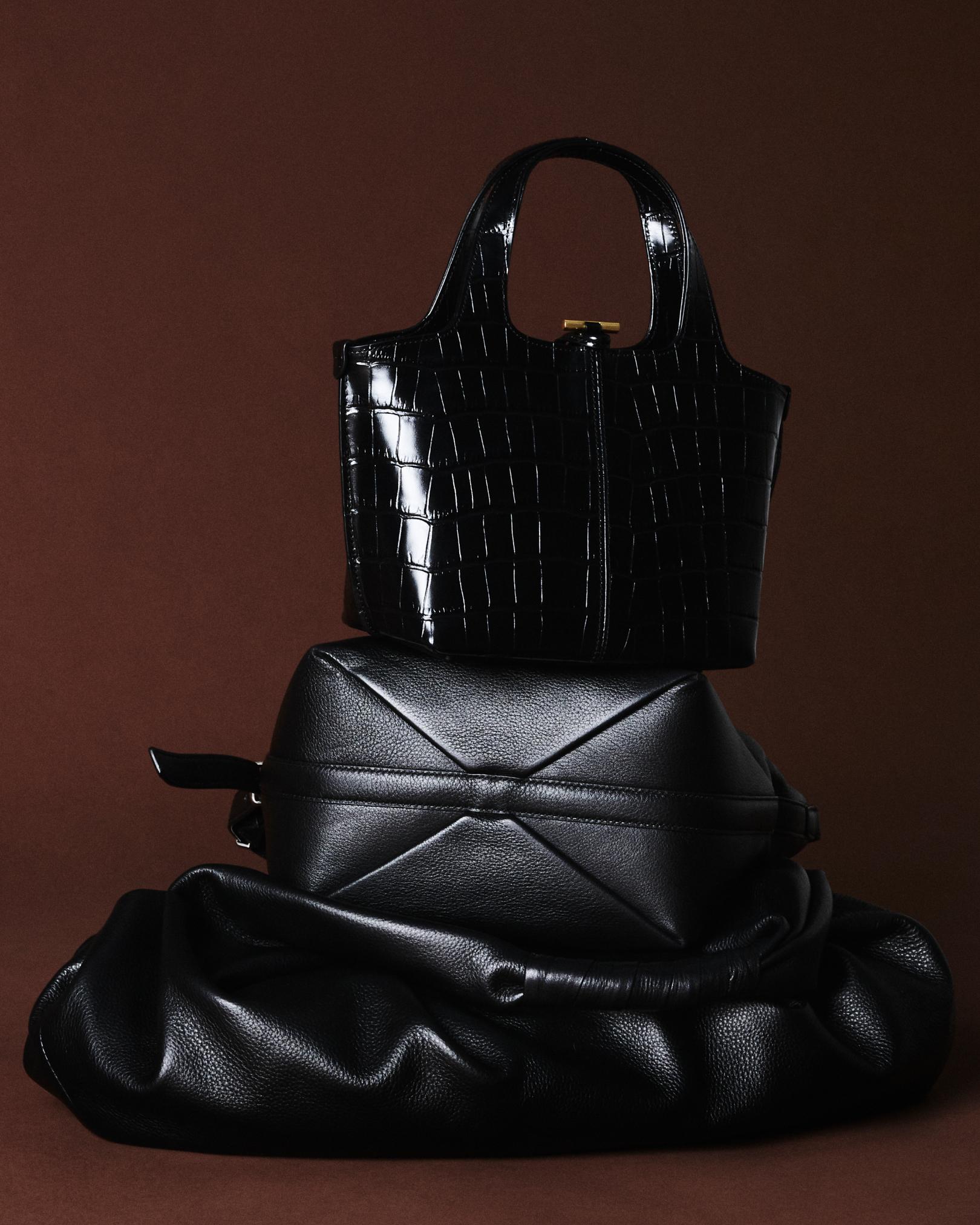
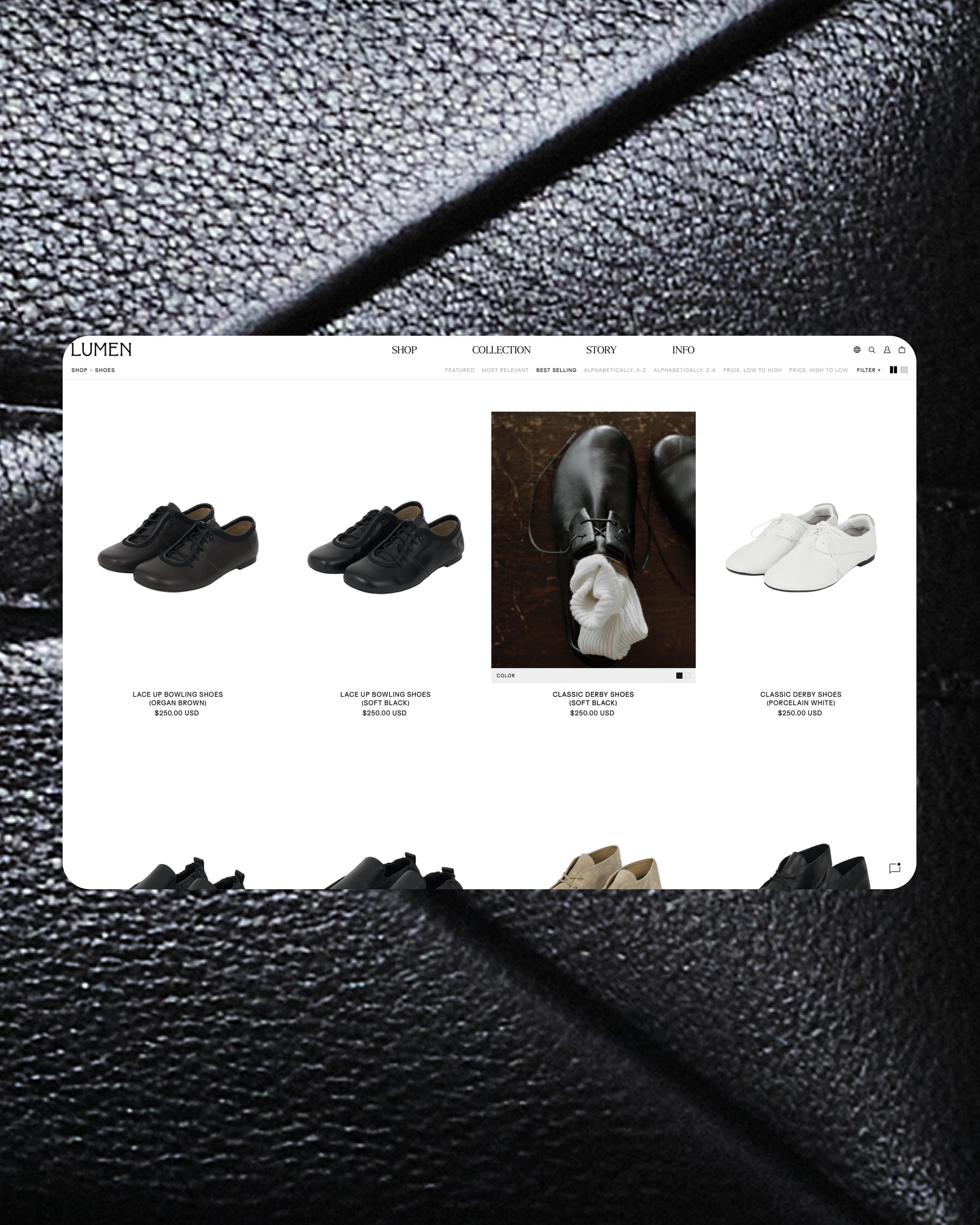
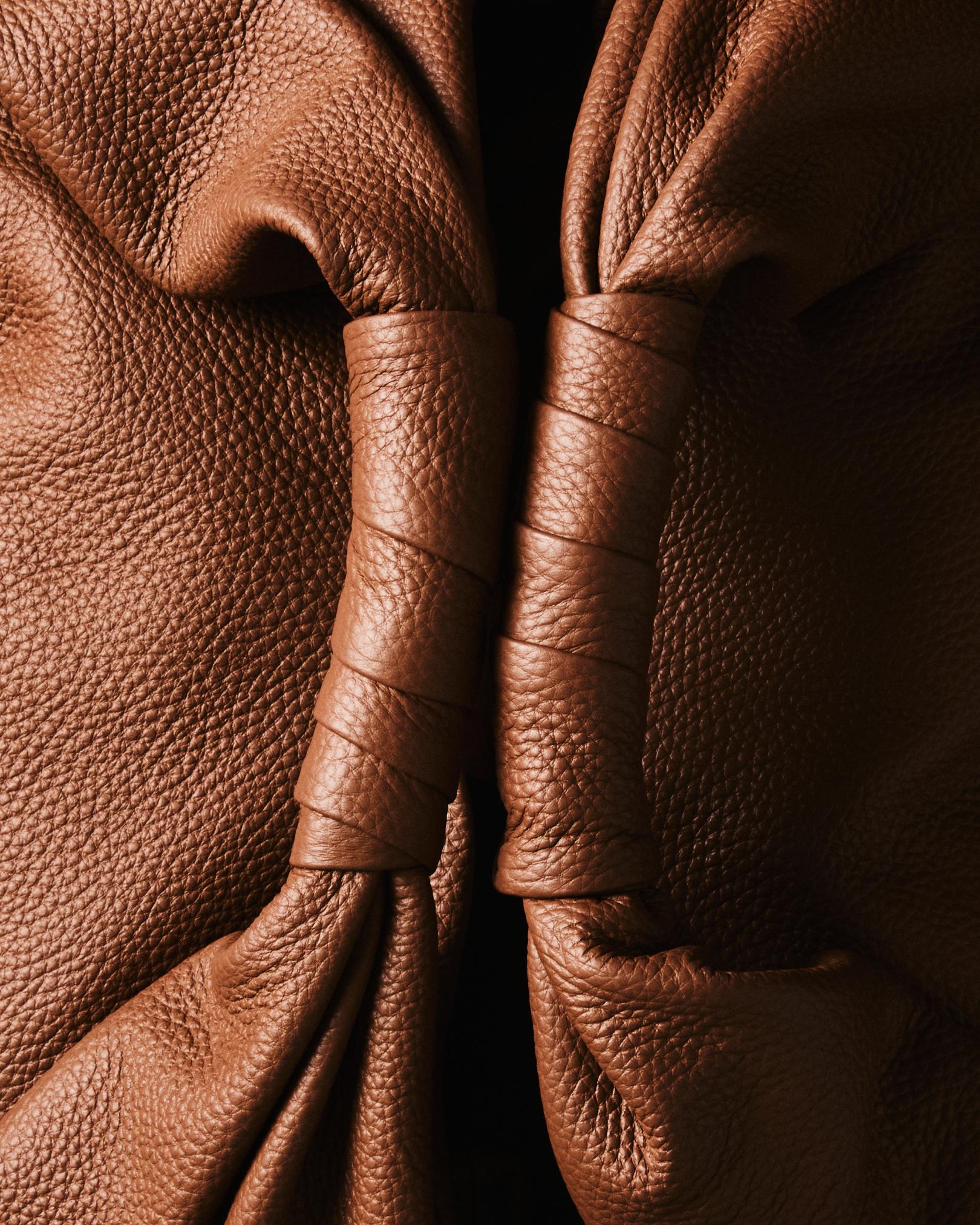
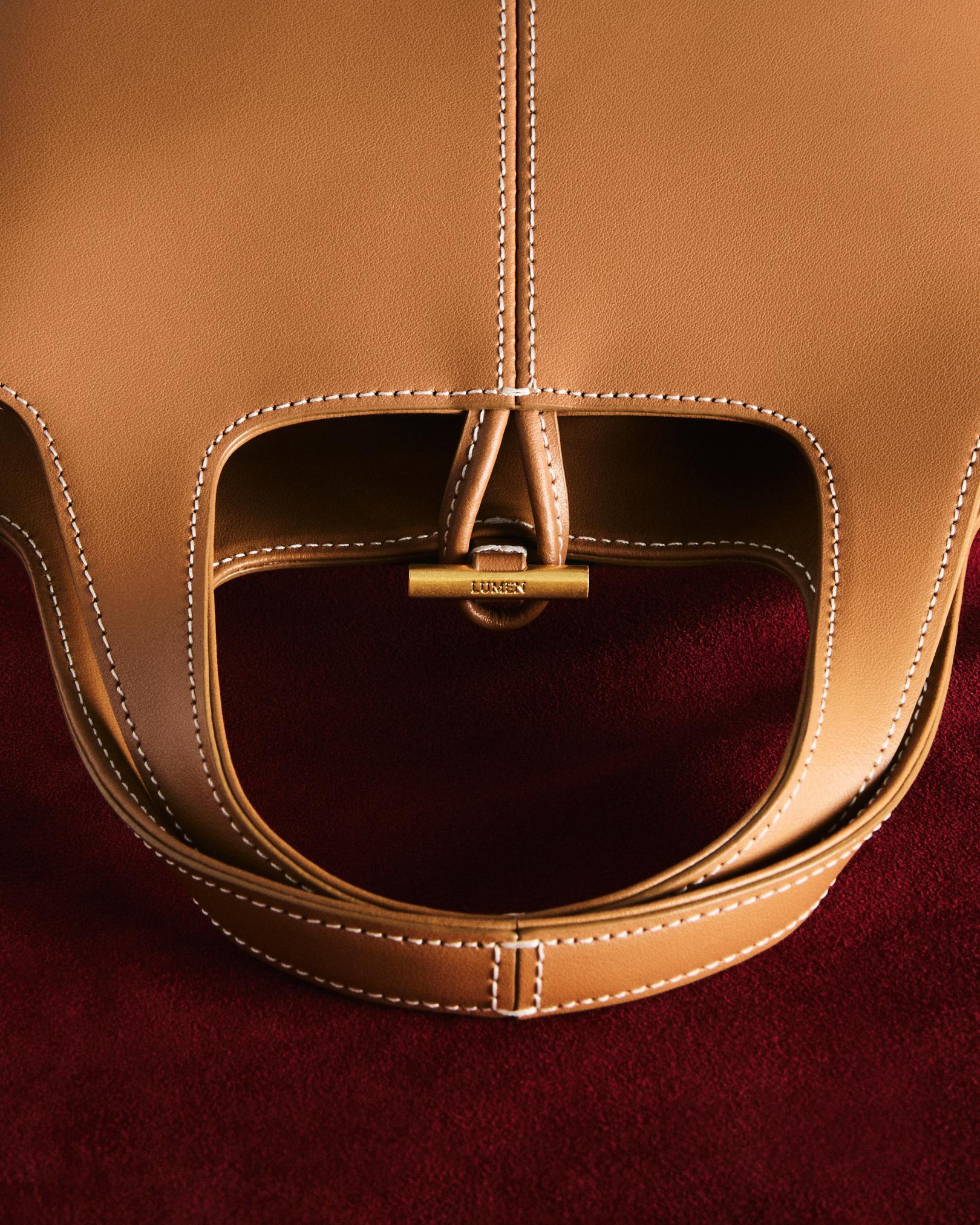
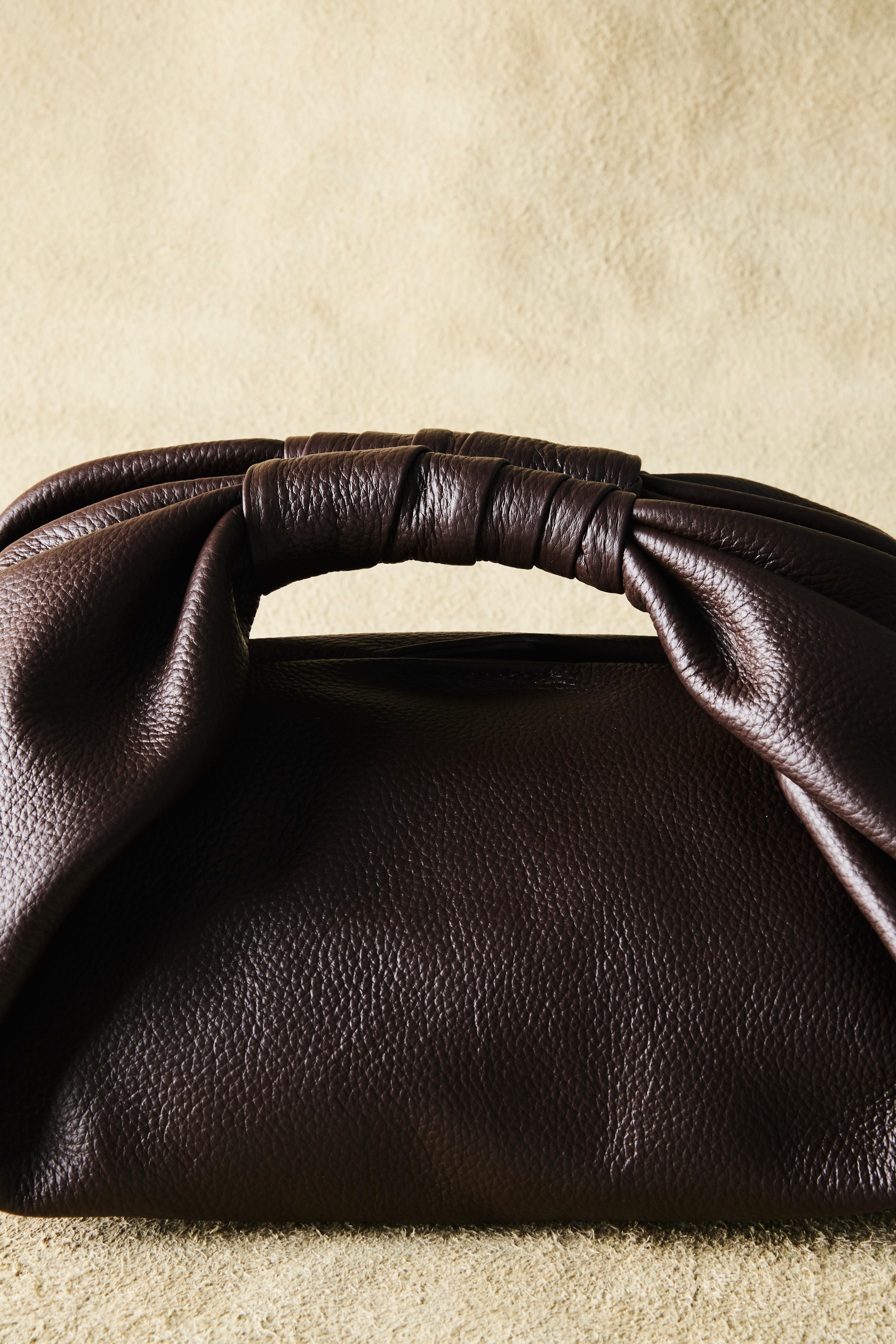
“A Black Experiment” provided the starting point for revealing form and material through light and contrast. We approached each bag as an object, studying its silhouette and weave while capturing the folds and surfaces of the leather up close. By producing both views of the complete product and close studies of its materials, we encouraged customers to move from an overall impression toward finer distinctions. The interface centered on black and white, drawing attention to product silhouettes and details. We composed moments for viewing products and reading information by adjusting image scale and placement, spacing, and typographic hierarchy. As though exploring a space furnished with objects, customers could follow a considered sequence of product images and descriptions. Product information served to connect sensory interest with practical choice. We organized information so that customers could distinguish color, material, and size, while also considering how they would move between product descriptions and purchasing conditions. Images and the interface were designed from the same perspective, allowing text and product information to complement the impressions of texture and form conveyed by photography. We planned, designed, and developed the domestic e-commerce website on Cafe24 and the international website on Shopify. The brand’s expression was adapted to each platform’s product registration methods and content structures, connecting the information managed by the teams with the browsing and purchasing experience. For the international website, we mapped existing product data to Shopify’s registration structure, imported the core data, and identified fields requiring separate entry or review. For the operational handover, we prepared platform-specific guides explaining how to update products and content. Registration and editing procedures, along with methods for linking information, were documented for Cafe24 and Shopify so that the intended experience could continue as new products and images were added. The work connected image production, product data, interface implementation, and operational guidance into one continuous process.
실행. 빛으로 형태를 드러내고, 정보와 운영으로 연결하기.
‘A Black Experiment’는 빛과 대비를 통해 제품의 형태와 소재를 드러내는 출발점이었습니다. 가방을 하나의 오브제로 바라보며 실루엣과 짜임을 살피고, 가죽 자체의 굴곡과 표면을 가까이 담았습니다. 제품의 전체 형태를 보여주는 장면과 재료의 질감을 보여주는 장면을 함께 제작해, 고객이 전체적인 인상에서 세부적인 차이로 시선을 옮길 수 있도록 했습니다. 인터페이스는 블랙과 화이트를 중심으로 제품의 실루엣과 디테일에 시선이 머무는 방향으로 전개했습니다. 이미지의 크기와 배치, 여백과 타이포그래피의 위계를 조율하며 제품을 바라보는 장면과 정보를 읽는 장면을 구성했습니다. 가구와 오브제가 놓인 공간을 살피듯, 제품 이미지와 설명이 일정한 흐름 안에서 읽히도록 화면을 설계했습니다. 상품 정보는 감각적인 관심을 실제 선택으로 연결하는 요소로 다뤘습니다. 색상과 소재, 크기를 구분해 읽을 수 있도록 정보의 위계를 정리하고, 제품 설명과 구매 조건을 확인하는 흐름을 함께 구성했습니다. 사진이 전하는 질감과 형태의 인상을 텍스트와 상품 정보가 보완하도록, 이미지와 인터페이스를 같은 관점에서 설계했습니다. 국내 이커머스는 Cafe24, 해외 이커머스는 Shopify를 기반으로 기획·디자인·개발했습니다. 두 플랫폼의 상품 등록 방식과 콘텐츠 구조에 맞춰 브랜드의 표현을 구현하고, 운영팀이 사용하는 정보가 고객의 탐색과 구매 화면으로 연결되도록 정리했습니다. 해외 이커머스에서는 기존 상품 자료를 Shopify의 등록 구조에 맞게 매핑하고 기본 데이터를 적재했으며, 별도로 입력하거나 확인해야 하는 항목을 안내했습니다. 운영 인수인계에서는 상품과 콘텐츠를 갱신하는 방법을 플랫폼별 가이드로 정리했습니다. Cafe24와 Shopify 각각의 관리 방식에 맞춰 등록·편집 절차와 정보 연결 방식을 전달해, 새로운 상품과 이미지가 추가될 때에도 기획한 경험을 이어갈 수 있도록 했습니다. 이미지 제작부터 상품 데이터, 화면 구현과 운영 안내까지 하나의 흐름으로 연결한 작업이었습니다.


Possibilities. Exploring with Ease, Choosing by Personal Taste.
ATELIER DE LUMEN’s domestic and international e-commerce websites launched in late March 2026. Alongside the final images capturing product forms and materials, we delivered Cafe24 and Shopify operating guides, bringing the brand’s expression into a working shopping experience and equipping the teams to manage products and content. The experience we sought to create was one in which customers could discover the craftsmanship of each product and choose according to their own taste. Moving from a bag’s outline to the grain of its leather, from the overall impression to the smallest details, was intended to become a process of understanding. We wanted the interest sparked by an image to lead to a closer examination of material, color, and size. Our hope is that LUMEN’s commitment to lasting forms and materials is conveyed consistently across different domestic and international shopping environments. By giving customers room to examine each product and imagine its place in their everyday lives, we aimed to support the experience of choosing an object to live with for years, on their own terms.
가능성. 매끄럽게 살피고, 자신의 취향으로 고르다.
아뜰리에 드 루멘의 국내·해외 이커머스는 2026년 3월 말 오픈했습니다. 제품의 형태와 소재를 담은 최종 이미지와 함께 Cafe24·Shopify 운영 가이드를 전달해, 브랜드의 표현을 실제 쇼핑 경험으로 구현하고 팀이 상품과 콘텐츠를 관리할 수 있는 기반을 마련했습니다. 이 프로젝트에서 지향한 것은 고객이 제품의 완성도를 스스로 발견하며 자신의 취향으로 선택하는 경험입니다. 가방의 윤곽에서 가죽의 결로, 전체적인 인상에서 작은 디테일로 시선을 옮기는 과정이 제품을 이해하는 시간이 되도록 했습니다. 이미지에서 느낀 관심이 소재와 색상, 크기를 살피는 구체적인 행동으로 이어지기를 의도했습니다. 국내와 해외의 서로 다른 구매 환경에서도 오래 사용할 수 있는 형태와 소재를 향한 루멘의 태도가 일관되게 전해지기를 바랍니다. 고객이 제품을 충분히 살펴보고 자신의 일상에 놓일 모습을 그려보며, 오래 함께할 물건을 자신의 기준으로 고르는 경험이 되기를 기대합니다.
- Visual direction, photography production, and final images
- Domestic Cafe24 e-commerce planning, design, development, and implementation
- International Shopify e-commerce planning, design, development, and implementation
- International e-commerce product data import and mapping
- Basic SEO setup
- Cafe24 and Shopify product and content management guides
- 비주얼 디렉션 및 촬영 프로덕션, 최종 이미지
- 국내 Cafe24 이커머스 기획·디자인·개발·구축
- 해외 Shopify 이커머스 기획·디자인·개발·구축
- 해외 이커머스 상품 데이터 적재 및 연결 구조 정리
- 기본 SEO 세팅
- Cafe24·Shopify 상품·콘텐츠 운영 가이드

Project Lead & Creative Direction,
Art Direction & Image Production,
E-Commerce Planning, UX/UI Design & Development
OTP Company
UX/UI Design
Joheun Yeom
Photography
Kyeonghee Kang
Image Production Assistants
Joheun Yeom, Yesaem Kim
Development Collaboration
Jinyoung Park
LUMEN Team
Mijin Um, Rira Yang, Jihye Choi, HyeBeen Lee