At Ground, on Edge
자연에서 감각으로, 아그네 레스토랑
- Brand Experience
- Art Direction
- Verbal Branding
- Web Design
- Web Development
- Graphic Design
2026
AGNE Restaurant

OTP Company shaped AGNE’s approach to seasonal ingredients and the chef’s sensibility into a consistent brand experience within and beyond the restaurant. Centered on “At ground, on edge.”, we developed the brand language and visual identity, connecting in-person interactions through menus, wine lists and signage with the website and social media, while designing for both the guest experience and ease of operation.
OTP Company는 AGNE의 제철 재료를 대하는 태도와 셰프의 감각을 고객이 공간 안팎에서 만나는 일관된 브랜드 경험으로 구축했습니다. ‘At ground, on edge.’를 중심으로 브랜드 언어와 시각 아이덴티티를 정리하고, 메뉴·와인리스트·사이니지 등 매장에서의 상호작용부터 웹사이트와 SNS까지 연결하며 고객의 경험과 팀의 운영 편의성을 함께 설계했습니다.

Purpose. From Ingredients to a Sensory Dining Experience.
As AGNE marked its first anniversary, it needed a consistent identity to articulate the intentions expressed through its food and space in clear language and form, and to share them more deeply with its guests. The challenge was to carry the vitality of the ingredients and the chef’s delicate sensibility through every stage of the experience—from discovering the restaurant and reading the menu to enjoying a dish. OTP Company shaped this direction around “At ground, on edge.” Ground represents the vitality of ingredients rooted in the land and the seasons. Edge expresses the chef’s discerning eye and sensibility, which bring those ingredients into fully realized dishes and experiences. We sought to connect the brand’s language and visual expression to the dining experience itself, allowing both values to emerge from an ingredient’s origins to the moment it is experienced at the table. The different atmospheres and rhythms of dining by day and by night were equally important. The identity needed to sit naturally within both experiences, communicating essential information and supporting hospitality. As ingredients and menus change with the seasons, we also considered how the team could update content themselves while maintaining the brand’s expression.
목적. 재료와 공간의 감각을 하나의 다이닝 경험으로.
일주년을 맞은 AGNE에는 음식과 공간에서 쌓아온 지향을 분명한 언어와 형태로 정리하고, 고객과 더 깊이 나눌 수 있는 일관된 아이덴티티가 필요했습니다. 식사를 통해 전해지는 재료의 생동감과 셰프의 섬세한 감각이 매장을 발견하고, 메뉴를 읽고, 요리를 경험하는 과정에서도 자연스럽게 이어지도록 하는 것이 과제였습니다. OTP Company는 ‘At ground, on edge.’를 중심으로 그 방향을 구체화했습니다. Ground는 땅과 계절에서 비롯된 재료의 생동감을, Edge는 이를 요리와 경험으로 완성하는 셰프의 안목과 감각을 뜻합니다. 재료의 출발점부터 식탁에서 감각하는 순간까지 두 가치가 함께 드러나도록, 브랜드의 언어와 시각적 표현을 실제 다이닝 경험에 연결하고자 했습니다. 낮과 밤에 다르게 느껴지는 공간의 분위기와 식사의 흐름도 중요했습니다. 같은 아이덴티티가 서로 다른 시간대의 경험에 자연스럽게 어우러지면서, 고객에게 필요한 정보를 전하고 접객을 돕는 역할을 해야 했습니다. 계절에 따라 재료와 메뉴가 바뀌는 만큼, 팀이 내용을 직접 갱신하며 브랜드의 표현을 이어갈 수 있는 운영 방식도 함께 고려했습니다.


People. Understanding the Brand at the Table, by Day and by Night.
OTP Company visited AGNE to dine during both the day and the evening, and held extended conversations with Chef Mingwan Choi to understand the sensibility he wanted to convey through food, space and hospitality. Experiencing the atmosphere and rhythm of a meal at different times provided a tangible starting point for understanding the brand. Its intention to bring Eastern and Western cultures into dialogue through dining, and its respect for both ingredients in their natural state and a refined sensibility, became guiding principles for language and design. We also considered the interactions that could arise as guests read the menu, chose food and wine, listened to explanations or needed guidance within the space. At each point, we considered what guests could read and understand independently and what might lead to further explanation from the chef and team, shaping the brand’s expression to work within the service experience. We gave equal attention to the people operating the restaurant. Editing and printing menus and wine lists, and introducing new ingredients and news on the website and social media, needed to fit into the team’s daily work. The design developed through an understanding of both the experience offered to guests and the work required to prepare it.
사람. 낮과 밤의 식탁에서 브랜드를 이해하기.
OTP Company는 AGNE를 낮과 밤에 직접 방문해 다이닝을 경험하고, 최민관 셰프와 긴 대화를 나누며 요리와 공간, 접객에서 전하고자 하는 감각을 살폈습니다. 서로 다른 시간대에 머물며 느낀 분위기와 식사의 흐름은 브랜드를 이해하는 구체적인 출발점이 되었습니다. 동서양의 문화를 다이닝 안에서 풀어가려는 지향, 자연스러운 재료의 상태와 정제된 감각을 함께 존중하는 태도를 언어와 디자인의 기준으로 삼았습니다. 고객이 메뉴를 읽고 음식과 와인을 선택하며 설명을 듣는 순간, 공간에서 안내를 필요로 하는 순간에 어떤 상호작용이 일어날지도 함께 살폈습니다. 각 접점에서 고객이 스스로 읽고 이해할 정보와 셰프와 팀의 설명으로 이어질 내용을 고려하며, 브랜드의 표현이 실제 서비스 안에서 작동하도록 방향을 구체화했습니다. 운영하는 사람의 사용 방식도 같은 비중으로 다뤘습니다. 메뉴와 와인리스트를 수정하고 출력하는 일, 새로운 재료와 소식을 웹사이트와 SNS에 소개하는 일이 팀의 일상적인 업무 안에서 이어질 수 있도록 했습니다. 고객에게 전하는 경험과 이를 준비하는 팀의 작업을 함께 이해하며 디자인을 발전시켰습니다.


Practice. Designing for In-Person Interactions and Everyday Operations.
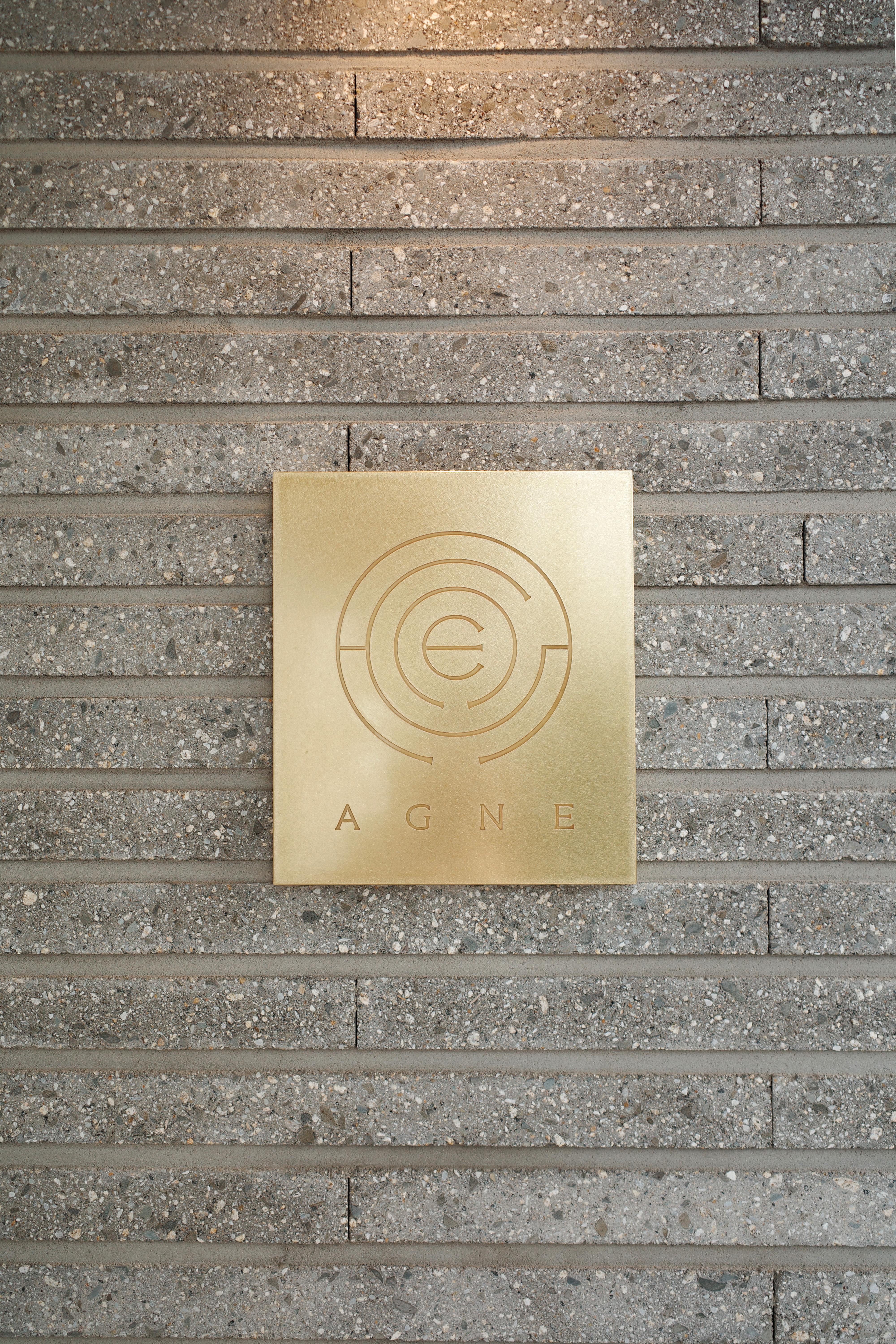
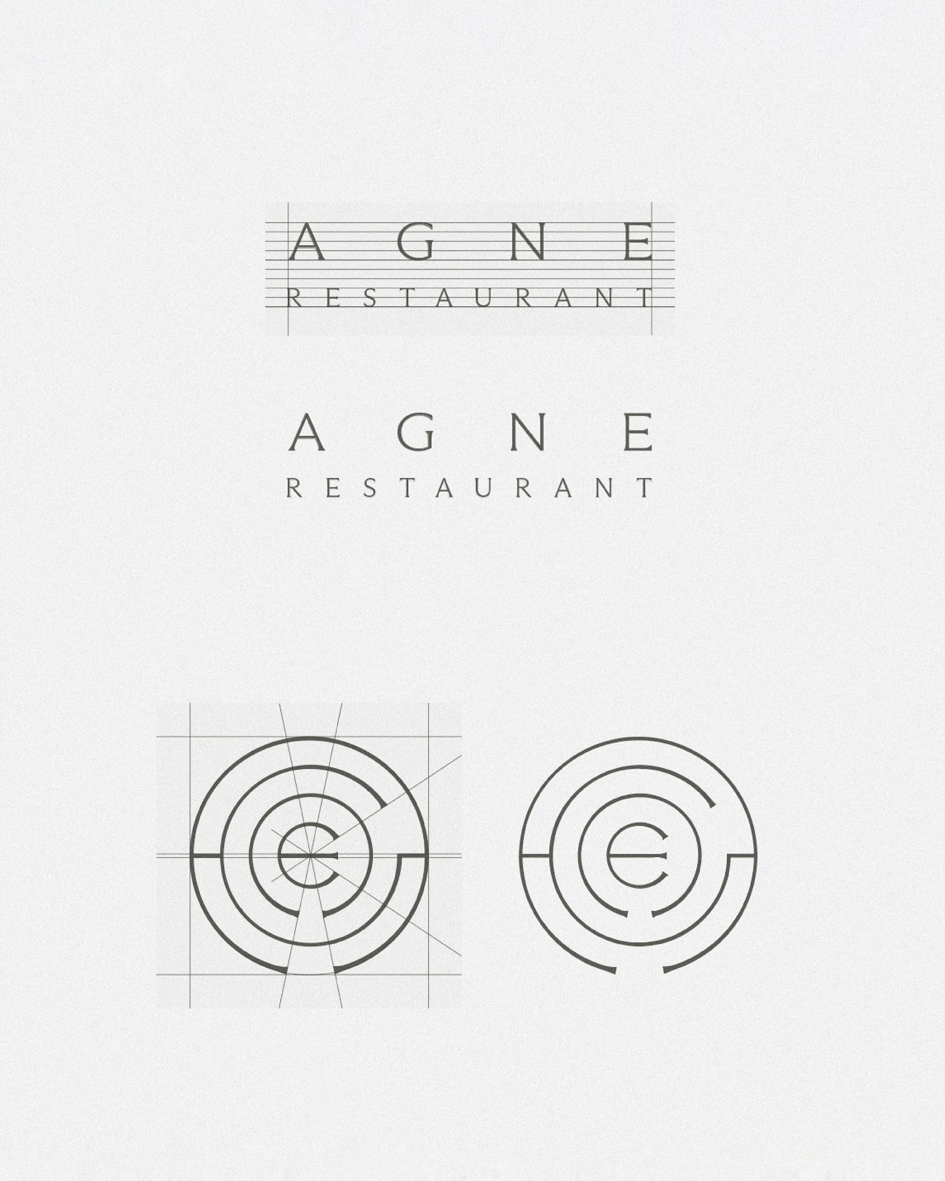
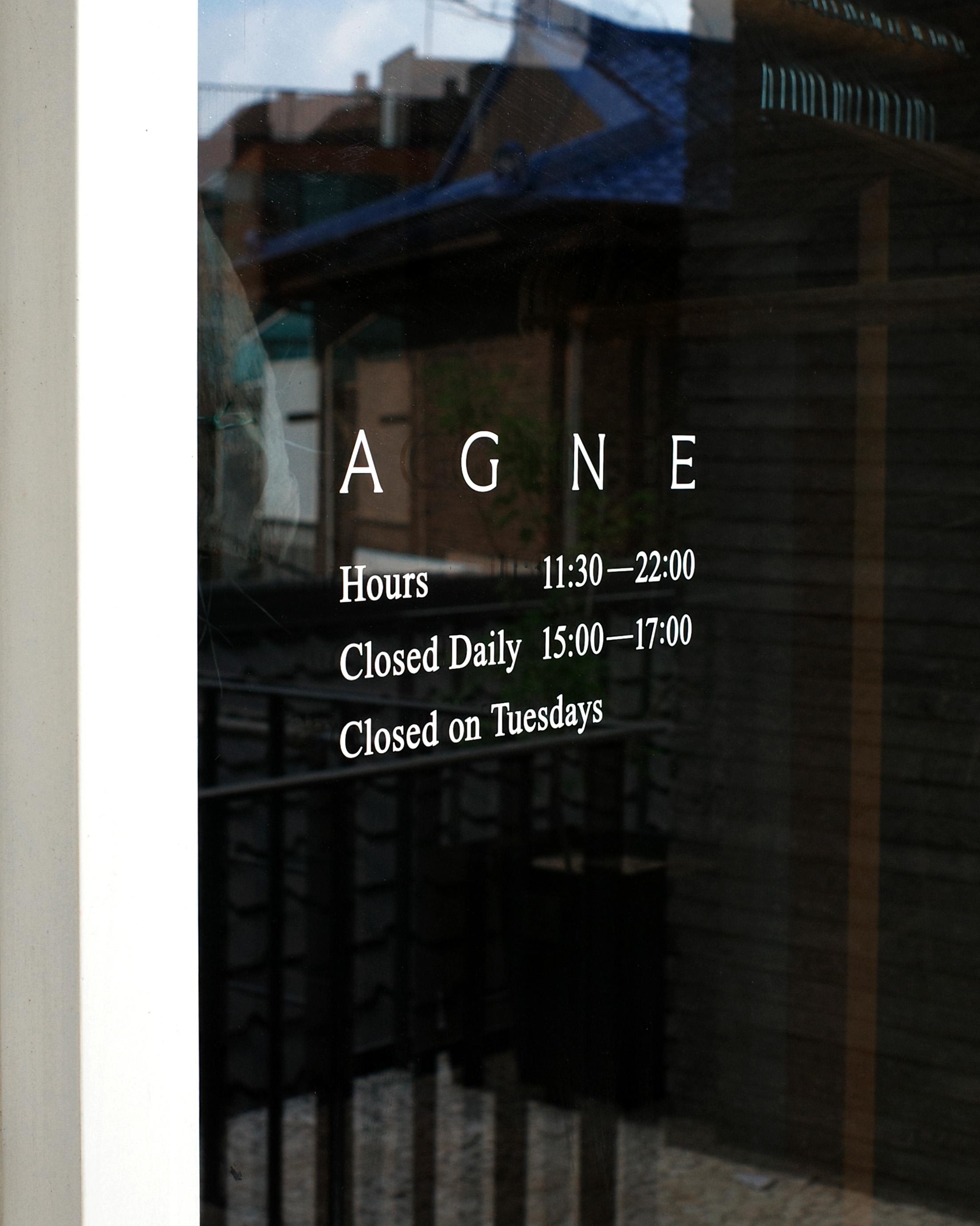
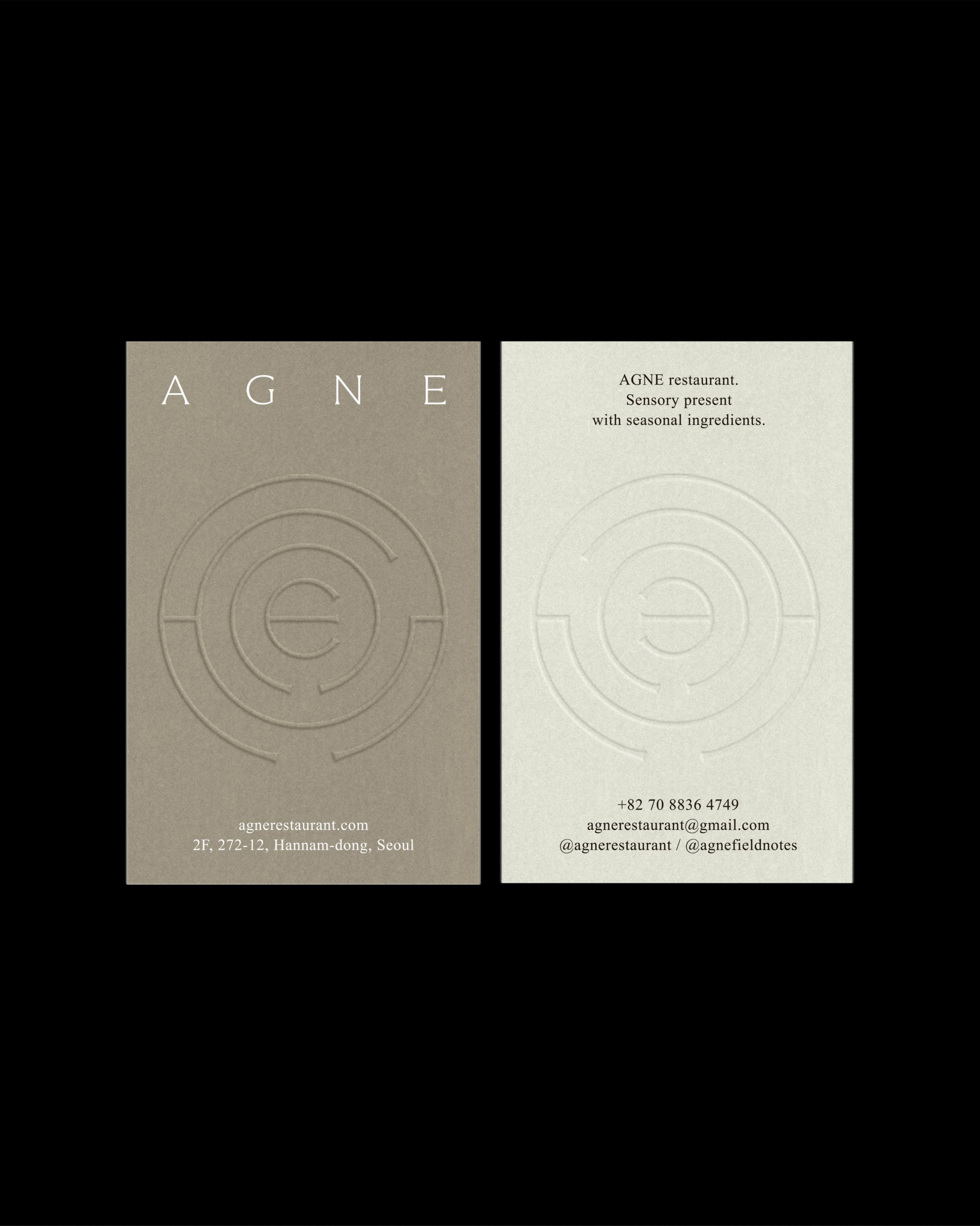
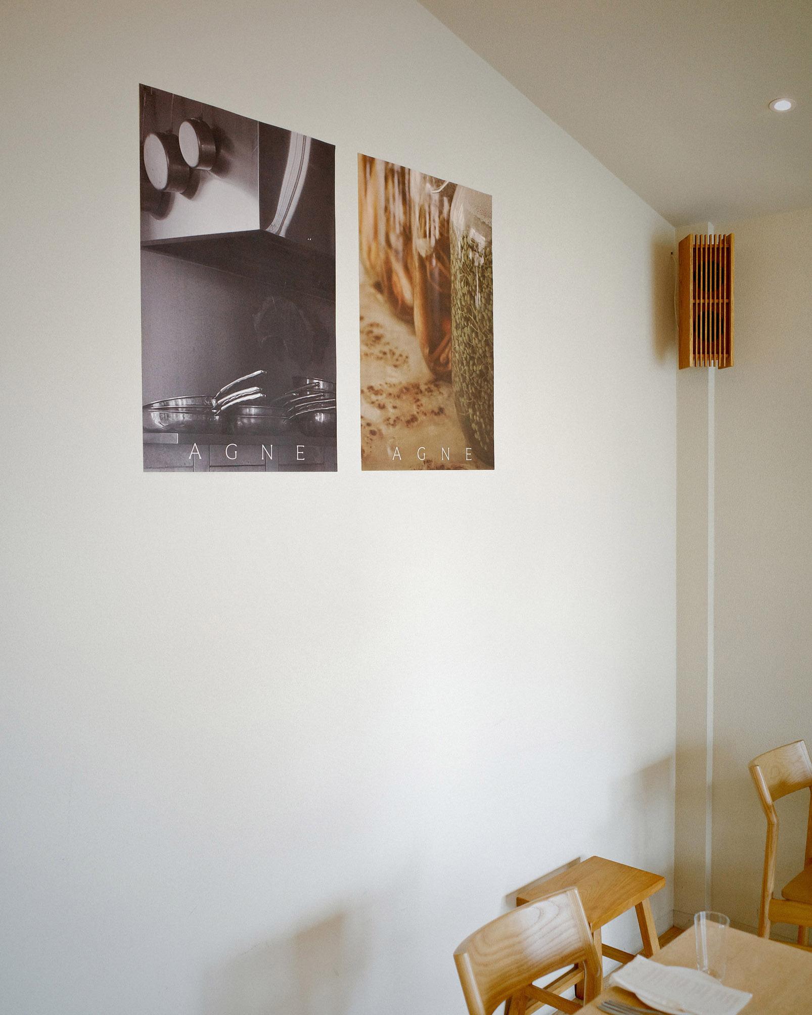
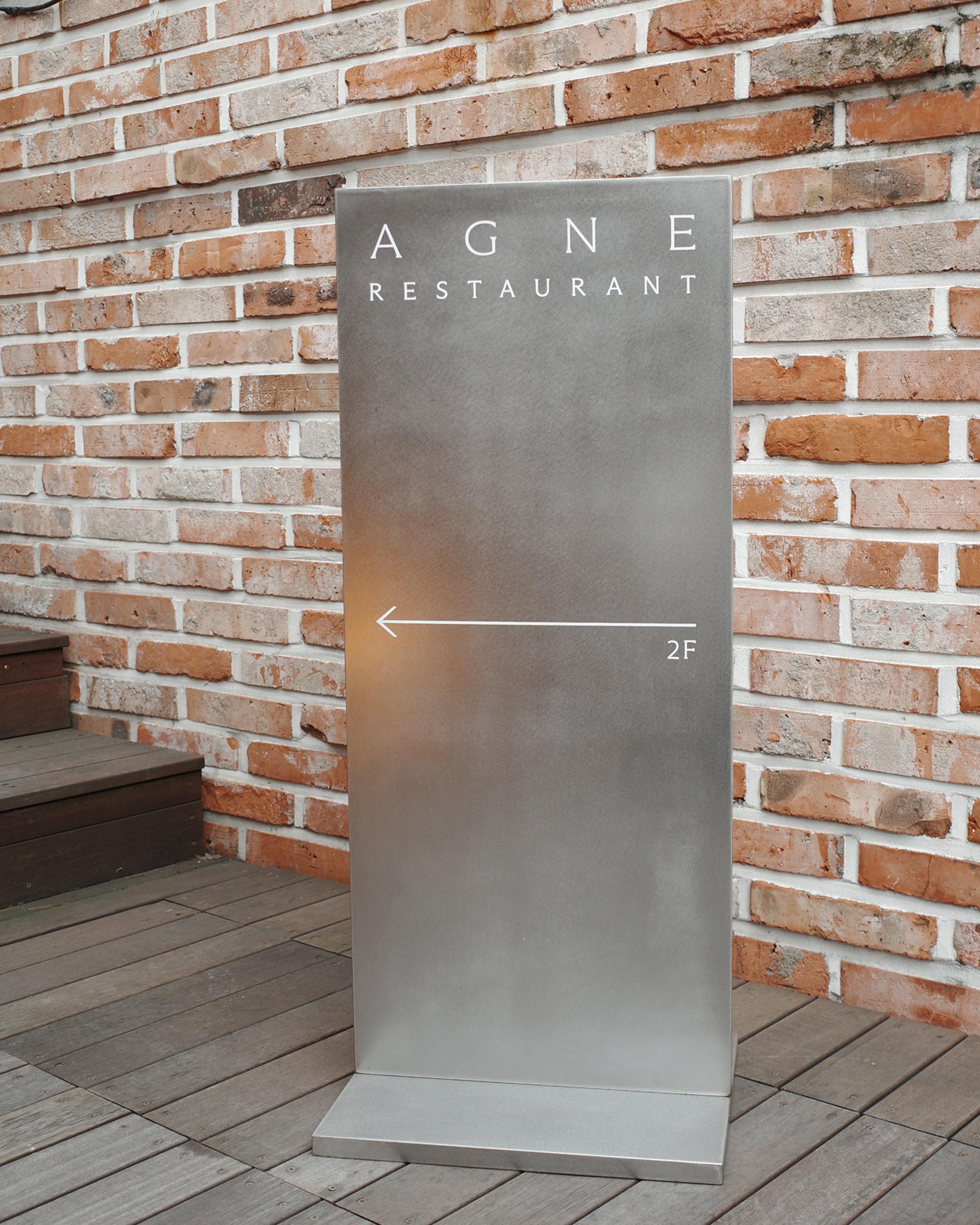
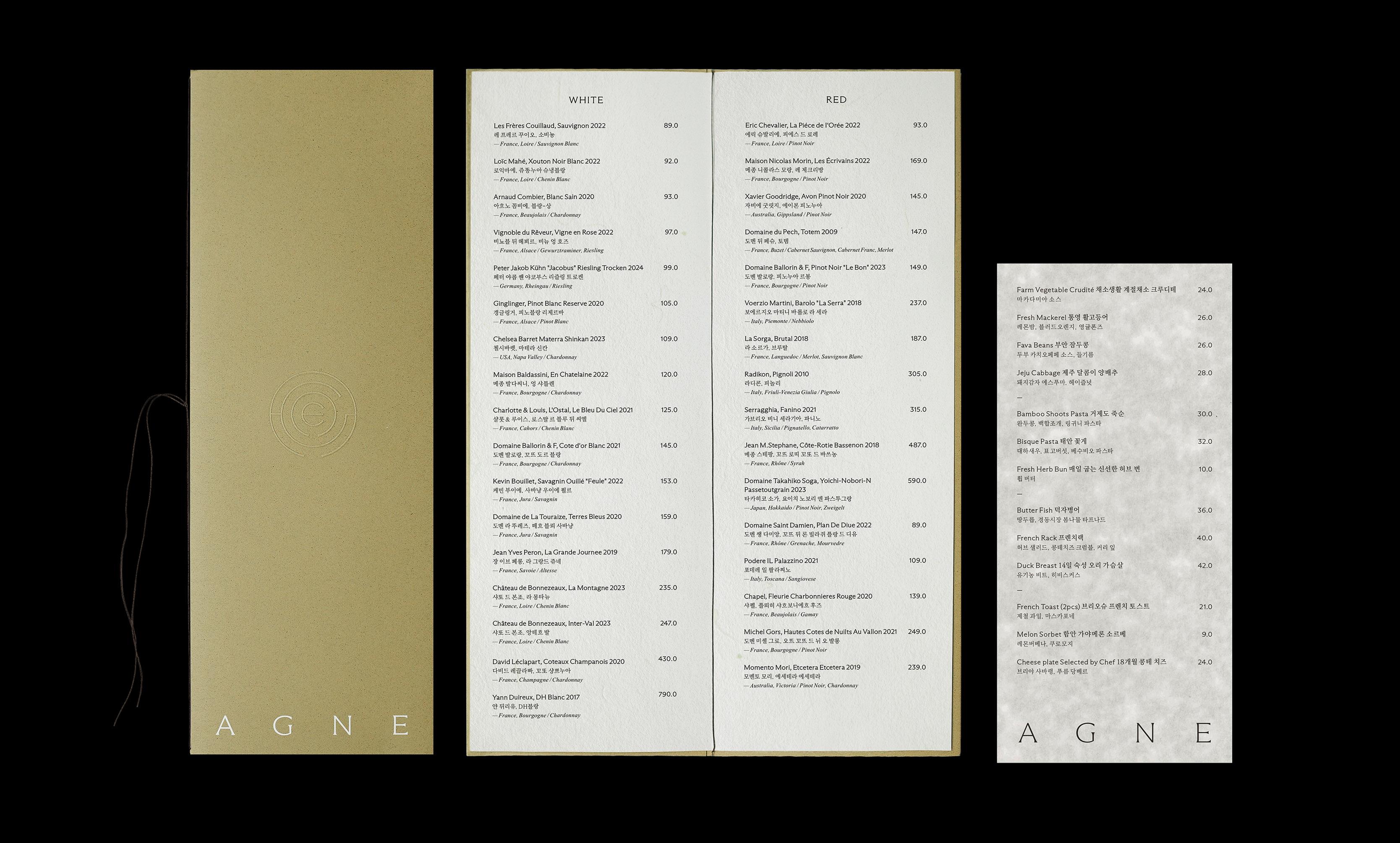
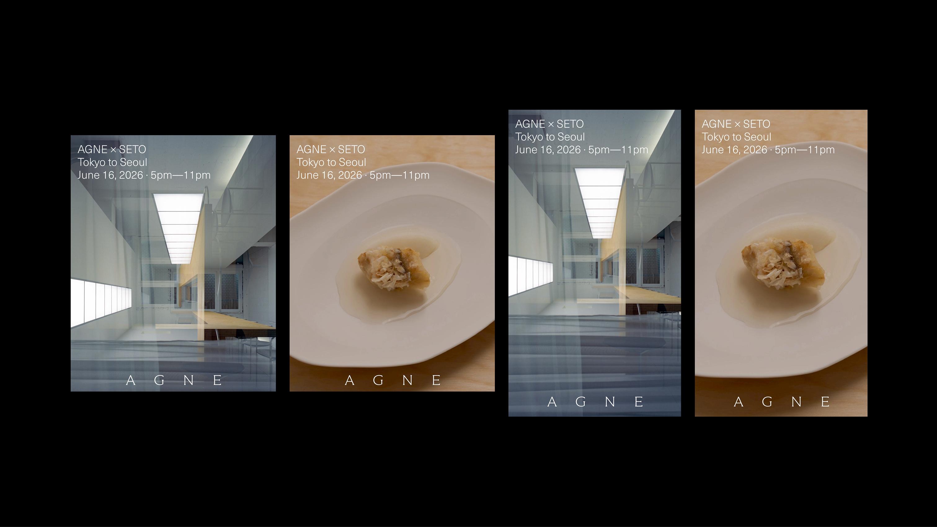
For the verbal branding, “At ground, on edge.” became the central phrase through which AGNE’s two values could be understood together. It brings ingredients rooted in the earth and the chef’s discerning touch into a concise expression, establishing a direction for brand introductions and content to explore that relationship. Seasons, ingredients and an approach to cooking became the concrete language through which AGNE expresses itself. The symbol reinterprets AGNE’s letters as tree rings, placing the brand’s name within the traces of time left by nature. We extended it alongside the logotype across menus, wine lists, business cards, napkins, restaurant posters and signage. Drawing on our experiences of dining by day and by night, we considered the impression each medium would create within the space and the guest actions it would accompany. Menus and wine lists were treated as points of interaction where guests read, choose and converse with staff. We organized their presentation so that information about food and wine could be read naturally within the flow of a meal, and provided editable files and guides so the team could revise and print seasonally changing content themselves. The impression conveyed to guests and the procedures for updating information were designed together. Signage was developed to announce the restaurant’s presence and provide guidance for using the space. We designed an engraved brass wall plaque and a stainless-steel standing sign with vinyl graphics, carrying the identity across different materials and scales. Window graphics and restroom notices followed the same visual language, extending attention to the smaller points of contact within a guest’s visit. Playlists for AGNE were created as a way to convey its atmosphere through sound. Drawing on the different sensations experienced during daytime and evening dining, we interpreted the two keywords, GROUND and EDGE, through music. The intention was to express the vitality of the ingredients and the chef’s delicate sensibility through sound as well as visuals and language, allowing AGNE’s atmosphere to continue into everyday life after guests leave the restaurant. The website brought together playlists and a background that changes with sunrise and sunset, connecting the passage of time and sound to the digital experience. For social media, we provided post and story templates with replaceable images and text, alongside an editing guide, enabling the team to continue introducing new ingredients and stories in AGNE’s language.
실행. 하나의 태도를 언어와 형태로 옮기다.
버벌 브랜딩에서는 ‘At ground, on edge.’를AGNE의 두 가치를 함께 읽는 중심 문장으로 삼았습니다. 땅에 닿아 있는 재료와 이를 다듬는 셰프의 안목을 짧은 문장 안에 담고, 브랜드 소개와 콘텐츠가 이 관계를 풀어가도록 방향을 세웠습니다. 계절과 재료, 요리를 대하는 태도가AGNE를 설명하는 구체적인 언어가 되도록 구성했습니다. AGNE의 철자를 나이테 형태로 풀어낸 심볼은 브랜드의 이름을 자연이 남기는 시간의 결 안에 담습니다. 이를 로고타입과 함께 메뉴와 와인리스트, 명함, 냅킨, 매장 포스터와 사이니지에 전개했습니다. 낮과 밤의 다이닝에서 파악한 감각을 바탕으로, 각각의 매체가 공간 안에서 어떤 인상을 만들고 고객의 어떤 행동과 만나는지 고려했습니다. 메뉴와 와인리스트는 고객이 내용을 읽고 선택하며 직원과 대화하는 접점으로 다뤘습니다. 음식과 와인에 관한 정보가 다이닝의 흐름 안에서 자연스럽게 읽히도록 표현 방식을 정리하고, 계절에 따라 달라지는 내용을 팀이 직접 수정하고 출력할 수 있도록 편집 파일과 사용 가이드를 마련했습니다. 고객에게 전달되는 인상과 정보를 갱신하는 운영 절차를 함께 설계했습니다. 사이니지는 매장의 존재를 알리고 공간 이용에 필요한 안내를 전하는 역할에 맞춰 전개했습니다. 현판은 신주 음각으로, 입간판은 스테인리스와 시트 그래픽으로 설계해 서로 다른 재료와 크기에서도 아이덴티티가 이어지도록 했습니다. 창문 시트 그래픽과 화장실 안내문까지 같은 브랜드의 표현 안에서 정리하며, 고객이 공간을 이용하는 과정의 작은 접점도 함께 다뤘습니다. AGNE를 위한 플레이리스트는 AGNE의 분위기를 소리로 전하는 접점으로 구성했습니다. 낮과 밤의 다이닝에서 경험한 서로 다른 감각을 바탕으로, GROUND와 EDGE라는 두 키워드를 음악으로 풀어냈습니다. 재료의 생동감과 셰프의 섬세한 안목을 시각과 언어뿐 아니라 청각으로도 느끼며, 공간을 떠난 뒤에도 AGNE의 분위기를 일상에서 이어갈 수 있도록 의도했습니다. 웹사이트에는 일출과 일몰에 따라 배경색이 바뀌는 장치와 플레이리스트를 함께 담아, 시간의 흐름과 소리를 디지털 경험에 연결했습니다. SNS에는 이미지와 텍스트를 교체할 수 있는 포스트·스토리 템플릿과 편집 가이드를 마련해, 새로운 재료와 이야기를 AGNE의 언어로 지속해서 소개할 수 있도록 했습니다.


Possibilities. A Consistent AGNE Experience Across Seasons and Times of Day.
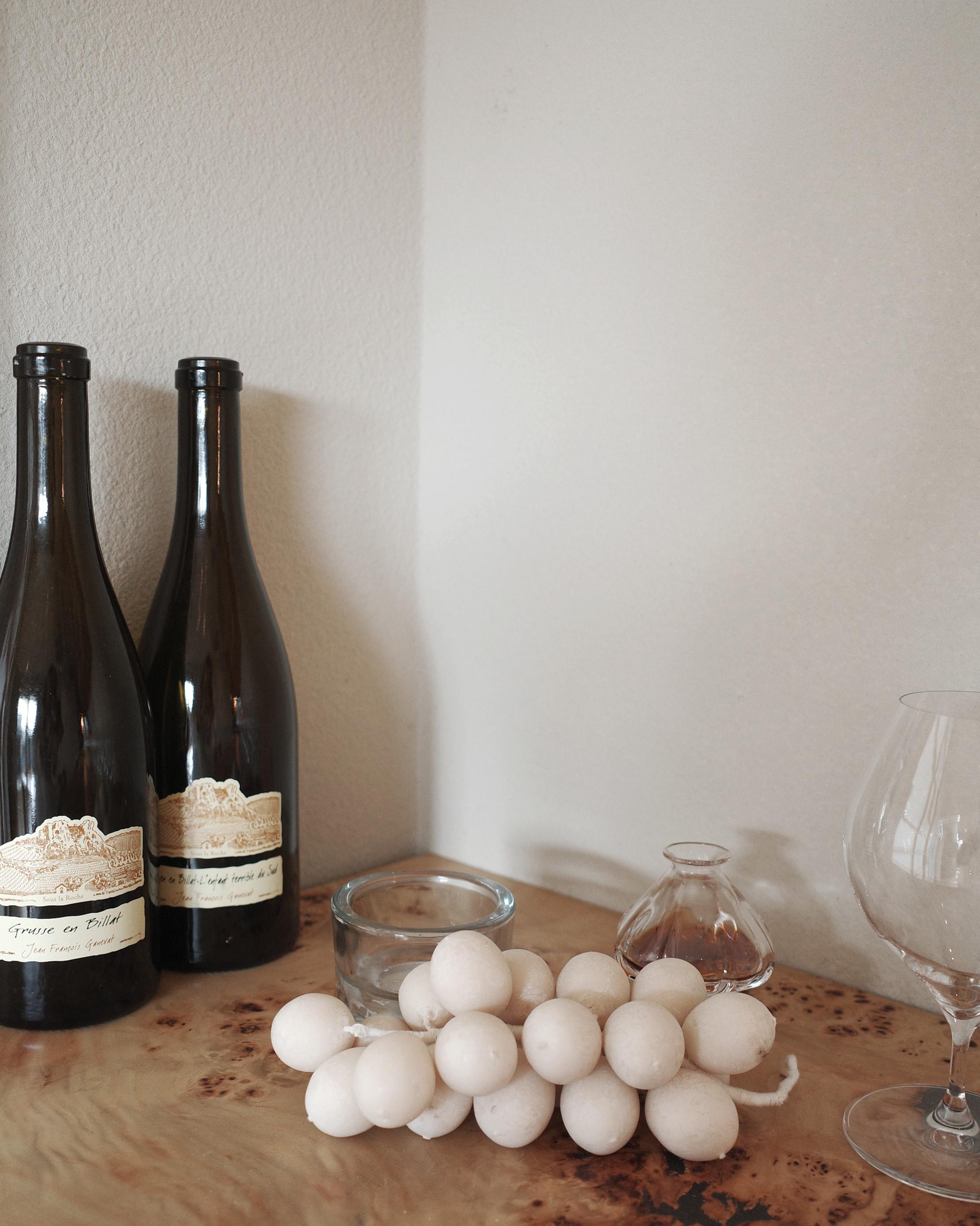
AGNE’s verbal and visual identity took shape through printed materials and signage designs for the restaurant, a public website, and social media images and templates. We also delivered editable files and guides for managing menus, wine lists and digital content, establishing a practical foundation for the team to introduce changing ingredients and stories themselves. The ingredients and menus at the table change with the seasons, while daytime and evening dining leave different impressions even within the same space. Through those changes, we hope the approach to ingredients and the chef’s discerning eye remain consistently present. We sought to connect the moments of reading a menu, discussing a dish and tasting it, inviting guests to follow their curiosity toward the origins of the ingredients and the thinking behind their preparation. We hope AGNE’s identity offers guests a way to experience the space and food more deeply, and gives the team a language through which to continue telling their own story naturally.
가능성. 계절이 바뀌어도 이어지는 AGNE의 언어.
AGNE의 브랜드 언어와 시각 아이덴티티는 매장용 인쇄물과 사이니지 디자인, 공개 웹사이트, SNS 이미지와 템플릿으로 구체화되었습니다. 메뉴와 와인리스트, 디지털 콘텐츠를 관리하는 편집 파일과 가이드도 함께 전달해, 팀이 변화하는 재료와 이야기를 직접 소개할 수 있는 운영 기반을 마련했습니다. 계절마다 식탁에 오르는 재료와 메뉴는 달라지고, 같은 공간에서도 낮과 밤의 다이닝은 다른 감각으로 남습니다. 그 변화 속에서도 재료를 대하는 태도와 셰프의 안목이 일관되게 전해지기를 바랍니다. 메뉴를 읽고, 요리에 관해 대화를 나누고, 한 접시를 맛보는 순간들이 서로 이어지며 고객의 관심이 재료의 출발점과 요리에 담긴 생각으로 확장되도록 하고자 했습니다. AGNE의 아이덴티티가 고객에게는 공간과 음식을 더 깊이 경험하는 단서가 되고, 팀에게는 자신의 이야기를 자연스럽게 이어가는 언어가 되기를 기대합니다.

- Verbal branding
- Symbol and logotype
- Business cards
- Menu and wine list design and production, editable files and usage guides
- Napkin design
- Wall plaque, standing signage, window vinyl graphics and informational notices
- Restaurant posters
- Website design and development, content management system, deployment and operations manual
- Social media images, templates and editing guide
- Playlists
- 버벌 브랜딩
- 심볼 및 로고타입
- 명함
- 메뉴·와인리스트 디자인 및 제작, 편집 파일 및 사용 가이드
- 냅킨 디자인
- 현판·입간판·창문 시트 그래픽 및 안내문
- 매장 포스터
- 웹사이트 디자인 및 개발, 관리자 시스템, 배포 및 운영 관리 매뉴얼
- SNS 이미지, SNS 템플릿 및 편집 가이드
- 플레이리스트

Project Lead,
Strategy & Creative Direction,
Verbal & Visual Identity,
Print & Signage Design,
Website Design & Development,
Playlists
OTP Company
Art Direction & Visual Identity,
Print & Signage Design
Joheun Yeom
AGNE Restaurant
Owner Chef, Mingwan Choi